In the lab…
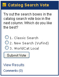
I am trying another experiment to get participation in the library website redesign process. This time I have created a little survey in LibGuides to test three potential catalog search options. Here’s my voting box:

Library Labs in LibGuides
I created the Library Labs last semester for this kind of thing. I looked at many Library Labs pages before settling on LibGuides as the best option to create this. The other options I considered were a WordPress blog and a page on regular library website. The library already has a WordPress.com blog that generally works well enough for our purposes, but as you may know you can’t change a whole lot for free on WordPress.com blogs. The tagging and template customization that would be necessary wouldn’t be possible for free. And why pay for a hosted blog when we already have scads of servers on campus plus two other candidate CMSs? Moving our blog to be self-hosted is on my to-do list for the future, but in the mean time I looked at both our CMS options. The CMS used for our regular website isn’t really meant to do all the things that were important to me in this project: namely, a very social and interactive feeling that would allow everyone to vote and comment. I am sure there are modules that could extend it to do so, but the only ones I found were very expensive, and anyway I don’t have any say over the administration of that CMS. Since all that is built into LibGuides already, I went with that. My concern is that it doesn’t look as “official” as the regular website, but I suspect that might make people feel more comfortable contributing. I also find that LibGuides get to be terribly cluttered, so I have tried to stick to no more than two columns per page and minimize the boxes.
But does it work?
Statistics show that people do look at it, but I have to be very proactive in driving people to the page. You can see from the chart below that when it started in October some people viewed the page but didn’t view the website redesign tab. Then in November lots of people viewed it because I made updates and let people know about it. In December I pushed the Browser Toolbar tab, so people looked at that and not the website redesign page. Oddly enough, in January (not in the chart) the views are exactly even for each tab (there’s a new one for database trials).
“Library Labs” Page Hits 2010
| Page | Oct | Nov | Dec | Total |
| Browser Toolbar | – | – | 24 | 24 |
| Home | 40 | 75 | 40 | 155 |
| Website Redesign | 8 | 27 | 7 | 42 |
| Totals | 48 | 102 | 71 | 221 |
Overall, I am happy with how this has gone so far. Not a lot of people have commented or submitted feedback, but I think that’s only to be expected– it’s still a relatively new feature, and getting anyone to fill out surveys or make comments except when they are annoyed about an already existing feature is difficult. I do count on the LIS students here to be the ones interested in participating, and I hope to do a lot more outreach with them in the future on this project.