As a way to relax and unwind during a stressful work week, I decided to do some arts and crafts with electronic resources. I wanted to make the simplest interface the database would allow. The purpose was twofold: I had to straighten out messy EBSCO research database profiles, but I also wanted to play around with EBSCO’s customization features since I knew they were more thorough than other vendors.
For those of you who aren’t aware of what the back end of a research database looks like for the administrator (and I am just fine with not knowing what the back end looks like for the developer, thanks), it’s a lot of options that make the database work properly with your A-Z list of journals, OpenURL resolver, proxy server, catalog, authentication, and branding, among other things. A lot of that stuff you set up at the beginning when you first acquire the database, and what’s possible to customize completely varies by vendor. For instance, some vendors don’t let you change any of that–you faxyour IP addresses and proxy server address, and then if you have to make any changes, you call or sometimes fax again to do so. Some vendors are much more lenient, even letting you remove their big branding from the top of the page and put in yours. Most are somewhere in between. Maintaining all these various options and tuning them up from time to time is what’s called electronic resource management, which also encompasses many other tasks. In case you are one of my non-librarian friends and wondered what I am talking about when I say that.

So back to EBSCO. They are one of those vendors which allow you a lot of freedom in changing every aspect of the search experience down to an extremely granular level. A level to which I do not have time to go, in fact, but certainly there was a lot of tune-up that needed to happen. The reason is that as of late 2011 they acquired H.W. Wilson and all of their databases. By about early February all those databases were incorporated into EBSCOHost research databases, and thus a lot of the search options needed a bit of refinement. But I was also interested in what I could take away and still leave a useable product. Enter: the Google-y EBSCOHost.
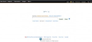
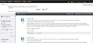
“Why can’t this work like Google?” is a question a lot of people, librarians and students alike, ask fairly often. If you’ve read Alan Jacobs’ recent piece on the Atlantic website you’ll see some good arguments for why it’s important to work on library research interfaces. I remember Aaron Schmidt declaring in a talk “Patrons shouldn’t see the word Boolean!” to resounding applause. While I don’t fully agree with either statement, I think it’s worth seeing what happens when you do try to make things more simple. In designing this profile, I took away as much as possible. The search options are not as visible, but still there (Google making advanced search and verbatim search as hard to find as they have recently annoys me no end, though this is apparently only annoying to nerds). The top bar is black like the ubiquitous Google bar. And the branding is for Dominican University (the size kind of sucks currently, that’s something to work on). Behind the scenes, Boolean searching is turned off completely. Just like our friend Google and their no more + operators except in verbatim search. But now patrons never see the word Boolean. The results page still has a lot on it, but it’s only two columns, like Google, with the results in the middle part of the grid and the options on the left bar.

I haven’t used this much yet, but I hope to show it in instruction sessions for students to demonstrate as something along the lines of training wheels for novice researchers. But I don’t think it’s an appropriate interface for in-depth research, because I know what options I took away from the user. Some of them make good research better for experienced searchers even if they make them more confusing for the novice. This is the advantage to having these different profiles available, and why it’s worth spending some time really understanding what your options are.
